Skip to main content
Consumer Goods & FMCG
E-Commerce
Economy & Politics
Energy & Environment
Health, Pharma & Medtech
Internet
Media
Technology & Telecommunications
Transportation & Logistics
Travel, Tourism & Hospitality
View all industries
Global data volume growth
Global AI market size
Number of generative AI users worldwide
Global inflation rate
Retail e-commerce sales worldwide
Largest economies worldwide
Biggest social media platforms by users
Global EV market share by manufacturer
International tourist arrivals by world region
Global annual CO₂ emissions
Browse recent statistics
Artificial intelligence (AI) worldwide
TikTok
Nvidia
E-commerce worldwide
Global GDP
Instagram
Apparel market worldwide
Video gaming worldwide
Global renewable energy industry
Influencer marketing worldwide
Browse recent topics
Consumer Trends 2026
Artificial Intelligence: in-depth market analysis
E-commerce challenges
Global economy
TikTok
Luxury goods: in-depth market analysis
Electric vehicles: A global overview
Video gaming worldwide
Travel and tourism trends 2026
Battery recycling worldwide
Browse recent reports
Consumer Insights
Advertising & Media
eCommerce
Consumer
Finance
Global Indicators
Health
Industrial
Mobility
Technology
Explore Market Insights
eCommerce Insights
Research AI
Book a demo
All integrations
Developer docs
Explore Statista Connect
Research
Strategy & Consulting
Marketing
Media & PR
Explore AI assistants
Marketing
Research & Development
Strategy
Sales
Find the fact
Tell the story
Win the pitch
Understand the market
Develop your strategy
Academia
Agencies
Consultancies
Consumer goods
Finance
Tech
Research solutions
Strategy consulting
Communication services
Explore Statista+
Statista R
Statista Healthcare
About Statista
First steps & help center
Webinar & training hub
Success stories
Individuals & Small Teams
Businesses & Enterprises
Academia & Government
English
Deutsch
Daily Data
Global stories vividly visualized
Jul 21, 2014
This chart shows the ten largest crypto-currencies, based on their market capitalization in July 2014.
More Information
Jul 18, 2014
This chart shows the top 10 wealthiest families in the United States in 2014.
More Information
Jul 16, 2014
This chart shows many people from selected countries think it's acceptable for the U.S. government to monitor communications from regular...
More Information
Jul 16, 2014
This infographic shows where, how and when Americans like to spend their summer holidays.
More Information
Jul 16, 2014
This chart provides an overview of military attacks since July 8th 2014.
More Information
Jul 15, 2014
This chart shows the brand retention rate for selected smartphone vendors.
More Information
Jul 14, 2014
This chart shows key facts on Twitter's video sharing service Vine, on its users and why marketers shouldn't ignore it.
More Information
Jul 14, 2014
This chart shows the most tweeted-about matches of the 2014 FIFA World Cup in Brazil.
More Information
Jul 11, 2014
This chart shows the quarterly growth of global PC shipments.
More Information
Jul 9, 2014
This chart shows the biggest World Cup wins in history.
More Information
Jul 8, 2014
This chart breaks down smartphone sales in four major markets between March and May 2014, by operating system.
More Information
Jul 8, 2014
This chart shows annual alcohol-attributable deaths per 100,000 residents by state.
More Information
Jul 3, 2014
This chart shows the average number of goals scored per match during different stages of the 2014 FIFA World Cup in Brazil.
More Information
Jul 3, 2014
This chart shows active devices running Android by version and smartwatch compatibility.
More Information
Jul 3, 2014
This chart shows the smartphone sales share in the UK by operating system.
More Information
Jul 2, 2014
This chart shows how many apps U.S. smartphone owners use per month and how much time they spend with apps.
More Information
Jul 2, 2014
This chart shows the UK App Economy revenue forecast 2013-2025
More Information
Jul 1, 2014
This chart shows the number of days lost through sickness absence from 1993 to 2013.
More Information
Jun 30, 2014
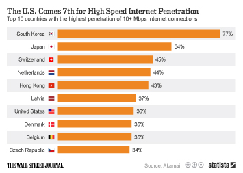
This chart shows the top 10 countries with the highest penetration of 10+ Mbps Internet connections.
More Information
Jun 27, 2014
This chart shows the average number of goals per World Cup match since 1930.
More Information
Jun 27, 2014
This chart shows the percentage of consumers who are willing to pay more for products and services from companies that are committed...
More Information
Jun 26, 2014
This chart breaks down the time spent with digital media in selected content categories in the U.S. in May 2014, by platform.
More Information
Jun 26, 2014
This chart shows cumulative installed solar photovoltaics capacity in leading countries.
More Information
Jun 25, 2014
This chart shows households with education debts in the United States
More Information
Jun 25, 2014
This chart shows reasons why shoppers use a computer as opposed to a mobile device.
More Information
Jun 23, 2014
This chart illustrates how interactions with branded content on Facebook correlate with reach.
More Information
Jun 23, 2014
This chart shows U.S. military drone crashes by year.
More Information
Jun 20, 2014
This chart shows major refugee-hosting countries at the end of 2013.
More Information
Jun 20, 2014
This chart shows how people plan to use their smartphones to follow the world cup.
More Information
Jun 20, 2014
This chart shows the total investments made in Brazil to host the 2014 World Cup.
More Information
Jun 19, 2014
This chart shows the percentage of the population agreeing they feel close to their neighbours in selected E.U. countries.
More Information
Jun 18, 2014
This chart shows how much Amazon Prime members spend on Amazon.com compared to regular customers.
More Information
Jun 18, 2014
This chart shows the number of World Cup tickets sold to fans from the following countries.
More Information
Jun 17, 2014
This chart shows the average number of interactions per Facebook post for the most engaging global brands on the social network.
More Information
Jun 17, 2014
This chart shows the market value of national team players at the 2014 FIFA World Cup.
More Information
Jun 16, 2014
This chart shows the percentage of online consumers in selected countries who have paid for online news in the past.
More Information
Jun 16, 2014
This chart shows the level of interest in soccer in selected countries in 2014
More Information
Jun 16, 2014
This chart shows combined world-wide sales of consoles and hand-helds ending in March of year shown.
More Information
Jun 13, 2014
The chart below shows the results of a survey among Brazilians regarding the situation in their country prior to hosting the World...
More Information
Jun 13, 2014
This chart shows the percentage of time spent viewing by source in the U.S. in March 2014.
More Information
Jun 13, 2014
This chart shows the annual earnings among 2014 World Cup managers.
More Information
Jun 12, 2014
This chart illustrates the increase in consumer IP traffic from 2013 to 2018.
More Information
Jun 12, 2014
This chart shows the average temperature at kickoff of 2014 World Cup group matches.
More Information
Jun 11, 2014
This chart shows video game console sales of Sony, Nintendo and Microsoft.
More Information
Jun 5, 2014
This chart shows the most popular FIFA World Cup players on Twitter.
More Information
Jun 4, 2014
This chart shows the TV series with the biggest average reach on Twitter in the past TV season. On average, more than 6 million Twitter...
More Information
Jun 4, 2014
This chart shows the estimated growth of smartphone subscriptions between 2013 and 2019, broken down by region.
More Information
Jun 3, 2014
This chart shows how accepting people in different parts of the world are of sharing communities.
More Information
Jun 2, 2014
The Environmental Protection Agency will reportedly propose new CO2 emission targets for U.S. power plants on June 2, 2014. Our chart...
More Information
Jun 1, 2014
This chart illustrates the difference in average selling prices of iOS and Android smartphones.
More Information
May 31, 2014
This chart shows the 12 networks with the most nominations at the 2014 Emmy Awards.
More Information
May 30, 2014
This chart shows estimated quarterly billings per user of Apple's iTunes and App Store.
More Information
May 28, 2014
This chart shows the Top 8 tablet brands in North America, based on their share of tablet-based web usage in April 2014.
More Information
May 28, 2014
This chart shows drug-induced deaths per million of the population in 2012.
More Information
May 27, 2014
This charts shows an estimated regional breakdown of Twitter's active user base from 2012 to 2018.
More Information
May 27, 2014
This chart shows the annual profits of forced labor per region.
More Information
May 26, 2014
This infographic illustrates key facts about the U.S. pharmaceutical industry.
More Information
May 26, 2014
This chart shows the performance of eurosceptic parties in the 2014 European elections.
More Information
May 23, 2014
This chart shows which social platforms are used by marketers. It also shows how the use of social networks in marketing differs depending...
More Information
May 23, 2014
This chart shows console power consumption in the most common operating modes.
More Information
May 21, 2014
This chart shows the estimated brand value of the world's most valuable brands in 2014.
More Information
May 21, 2014
This chart shows the average minutes per day spent with online activities in the U.S. in 2013.
More Information
May 20, 2014
This chart shows a breakdown of global smartphone shipments in the first quarter of 2014 by screen size.
More Information
May 20, 2014
This chart shows the most popular cities to take selfies in. According to an analysis of millions of social media posts by personalized...
More Information
May 19, 2014
This chart shows the top U.S. states by the number of permitted breweries in 2013.
More Information
May 19, 2014
This chart shows U.S. patent-infringement suits filed against the following companies in 2013.
More Information
May 16, 2014
This chart shows the 10 countries with the highest number of people newly displaced because of violence or conflict in 2013.
More Information
May 16, 2014
This chart illustrates how the Netflix connection speeds of Comcast subscribers have improved dramatically after the two companies...
More Information
May 15, 2014
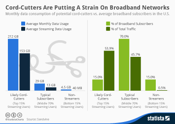
This chart compares the monthly data consumption of potential cord-cutters with that of average broadband subscribers in the United...
More Information
May 15, 2014
This chart shows Bulgarians and Romanians working in the UK.
More Information
May 14, 2014
This chart shows which applications account for the most mobile data traffic in North America
More Information
May 14, 2014
This chart shows total alcohol conumption per capita in litres of pure alcohol.
More Information
May 14, 2014
This chart shows Nintendo's home video game console sales since 1998.
More Information
May 13, 2014
This chart ranks the largest multichannel providers in the United States based on the number of video subscribers in Q1 2014.
More Information
May 13, 2014
This chart shows the proportion of seats held by women in national parliaments in 2013.
More Information
May 12, 2014
This chart shows how the maternal mortality ratio in the United States has changed over the past 23 years.
More Information
May 11, 2014
This chart shows the number of channels viewed by the average U.S. household.
More Information
May 9, 2014
This chart shows how many people in the world have access to clean drinking water and how many still haven't despite all progress....
More Information
May 8, 2014
This chart ranks the preferred headphone brands by American teens.
More Information
May 8, 2014
This chart shows how selected public Internet companies have fared on the first day early investors and employees could sell their...
More Information
May 8, 2014
This chart shows the results of a poll on whether Ukraine should remain united or allow regions to secede.
More Information
May 7, 2014
This chart shows where in-store shoppers prefer to get assistance.
More Information
May 7, 2014
This chart shows the the 10 largest online retailers in the United States, based on online retail sales in 2013.
More Information
May 7, 2014
This chart shows C02 emissions in the E.U. from new cars by fuel type.
More Information
May 6, 2014
This chart shows the reach of social networks among Americans aged 18 to 29 years.
More Information
May 6, 2014
This chart shows the percentage of U.S. Internet users reading hard copy and electronic books.
More Information
May 5, 2014
This chart shows the number of people killed by animals per year.
More Information
May 5, 2014
This chart shows the 10 most dangerous countries for journalists based on the number of journalists that have been killed between 2004...
More Information
May 5, 2014
This chart illustrates the rapid decline of Nintendo's hardware business.
More Information
May 5, 2014
This chart shows smartphone market share figures for the Chinese market in Q1 2014.
More Information
150
/
160
Contact
Get in touch with us. We are happy to help.
Do you still have questions?
Feel free to contact us anytime using our
contact form
or visit our
FAQ page
.
Your contact to the Infographics Newsroom
Felix Richter
Data Journalist
felix.richter@statista.com
+49 (40) 284 841 557