Skip to main content
Consumer Goods & FMCG
E-Commerce
Economy & Politics
Energy & Environment
Health, Pharma & Medtech
Internet
Media
Technology & Telecommunications
Transportation & Logistics
Travel, Tourism & Hospitality
View all industries
Global data volume growth
Global AI market size
Number of generative AI users worldwide
Global inflation rate
Retail e-commerce sales worldwide
Largest economies worldwide
Biggest social media platforms by users
Global EV market share by manufacturer
International tourist arrivals by world region
Global annual CO₂ emissions
Browse recent statistics
Artificial intelligence (AI) worldwide
TikTok
Nvidia
E-commerce worldwide
Global GDP
Instagram
Apparel market worldwide
Video gaming worldwide
Global renewable energy industry
Influencer marketing worldwide
Browse recent topics
Consumer Trends 2026
Artificial Intelligence: in-depth market analysis
E-commerce challenges
Global economy
TikTok
Luxury goods: in-depth market analysis
Electric vehicles: A global overview
Video gaming worldwide
Travel and tourism trends 2026
Battery recycling worldwide
Browse recent reports
Consumer Insights
Advertising & Media
eCommerce
Consumer
Finance
Global Indicators
Health
Industrial
Mobility
Technology
Explore Market Insights
eCommerce Insights
Research AI
Book a demo
All integrations
Developer docs
Explore Statista Connect
Research
Strategy & Consulting
Marketing
Media & PR
Explore AI assistants
Marketing
Research & Development
Strategy
Sales
Find the fact
Tell the story
Win the pitch
Understand the market
Develop your strategy
Academia
Agencies
Consultancies
Consumer goods
Finance
Tech
Research solutions
Strategy consulting
Communication services
Explore Statista+
Statista R
Statista Healthcare
About Statista
First steps & help center
Webinar & training hub
Success stories
Individuals & Small Teams
Businesses & Enterprises
Academia & Government
English
Deutsch
Daily Data
Global stories vividly visualized
Sep 11, 2014
This chart shows selected hybrid and non-hybrid vehicle models in comparison.
More Information
Sep 10, 2014
This chart shows the results of survey regarding the reasons for not using digital wallet services.
More Information
Sep 10, 2014
Annual average doctor visits per person in selected countries.
More Information
Sep 9, 2014
This chart illustrates how Apple's stock price reacted in the past after Apple had unveiled a new product, such as the original iPhone...
More Information
Sep 9, 2014
This chart illustrates which features smartphone users from five major markets consider most important in a smartwatch.
More Information
Sep 9, 2014
This chart shows key facts about the film industry in India.
More Information
Sep 8, 2014
This chart shows the average number of hours worked by U.S. workers, aged 18+.
More Information
Sep 7, 2014
This chart shows how much North American consumers would be willing to pay for Apple's long-rumoured iWatch.
More Information
Sep 5, 2014
This chart illustrates the positive effect that the ALS Ice Bucket Challenge had on ALS awareness around the world.
More Information
Sep 5, 2014
% of people un the U.S. who currently ever use the following in their primary car.
More Information
Sep 4, 2014
This chart shows in which situations Americans are concerned about online privacy.
More Information
Sep 3, 2014
This chart shows a smartphone shipment forecast for 2014 and 2018, broken down by screen size.
More Information
Sep 3, 2014
This chart shows the estimated number of jihadis in Syria from selected countries in 2014.
More Information
Sep 2, 2014
This chart shows key facts and statistics on the global and the U.S. apparel industry.
More Information
Sep 2, 2014
This chart illustrates the demographic shift that Africa is expected to experience over the next few decades.
More Information
Sep 2, 2014
This chart shows summer transfer window spending in 2014.
More Information
Sep 2, 2014
This chart shows what independence would mean for the rest of the UK.
More Information
Sep 2, 2014
This chart shows which methods American smartphone and tablet owners who use mobile payment services use to pay for goods and services.
More Information
Sep 1, 2014
This chart shows statistics on global Internet usage.
More Information
Sep 1, 2014
This chart shows the top cities/countries for international students in the United States.
More Information
Aug 29, 2014
This charts shows the top line platform stats for app usage in the United States.
More Information
Aug 29, 2014
This chart shows the percentage of current iPhone owners in the U.S. intending to upgrade.
More Information
Aug 28, 2014
This chart shows the average cost of raising a child to the age of 18 in the United States in 2013.
More Information
Aug 28, 2014
This chart shows the actors and actresses with the most Primetime Emmy Award Wins.
More Information
Aug 28, 2014
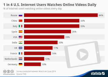
This chart shows the percentage of internet users watching online video every day.
More Information
Aug 28, 2014
This chart shows the number of adversarial conflicts involving police firearms discharges.
More Information
Aug 27, 2014
This chart shows the willingness to join conversations about government surveillance.
More Information
Aug 27, 2014
This chart shows the revenue and stores of selected coffee/restaruant chains worldwide in 2013.
More Information
Aug 27, 2014
Countries where the highest number of journalists have been killed in 2014.
More Information
Aug 27, 2014
This chart shows the % of parents planning a back to school purchase of the following items.
More Information
Aug 26, 2014
This chart shows the price of selected acquisitions by Amazon from 1999 to 2014.
More Information
Aug 26, 2014
This chart shows recent events in Eastern Ukraine by the numbers.
More Information
Aug 26, 2014
This chart shows the earnings of the best-paid DJs in 2014 (in million U.S. dollars).
More Information
Aug 25, 2014
This chart shows the number of monthly active WhatsApp users worldwide.
More Information
Aug 25, 2014
This chart shows the percentage change in Ferguson's ethnic population from 1990 to 2010.
More Information
Aug 25, 2014
This chart shows price increases on selected foods in St. Petersburg (since January 01, 2014)
More Information
Aug 22, 2014
This chart shows the top 10 mobile apps by unique visitors.
More Information
Aug 22, 2014
This chart compares U.S. military suicides and combat deaths from 2008 to 2012.
More Information
Aug 22, 2014
This chart gives an overview of the ALS Ice Bucket Challenge by the numbers
More Information
Aug 21, 2014
Mean number of URLs requested to be removed from Google search per day.
More Information
Aug 21, 2014
This chart shows transfer window spending 2013 vs 2014 (in million U.S. dollars).
More Information
Aug 20, 2014
This chart shows how often U.S. Internet users unplug.
More Information
Aug 20, 2014
This chart shows the value of military donations to law enforcement agencies (in million U.S. dollars),
More Information
Aug 20, 2014
This chart shows views on airstrikes against IS militants in Iraq.
More Information
Aug 19, 2014
This chart shows the launch weekend iPhone sales since 2008.
More Information
Aug 19, 2014
This chart shows the most stolen cars in the United States in 2013 in total units.
More Information
Aug 18, 2014
This chart shows the worldwide box office gross of movies starring Robin Williams (in million U.S. dollars).
More Information
Aug 15, 2014
This chart shows how the prices of smartphones shipped in Q2 2014 differ depending on their operating system.
More Information
Aug 15, 2014
This chart shows an age breakdown for nuclear reactors that are currently operational and for those that have already been shut down.
More Information
Aug 15, 2014
This chart shows the share of live births occurring outside marriage in the U.S. and selected European countries.
More Information
Aug 14, 2014
This chart shows the wind share of electricity generation in leading countries in 2013.
More Information
Aug 14, 2014
This chart shows the percentage of female employees in the workforce of selected American tech companies.
More Information
Aug 13, 2014
This chart shows the growth of Tencent's instant messaging and social media platforms.
More Information
Aug 13, 2014
This chart shows the value of sanctioned food exports to Russia by country
More Information
Aug 12, 2014
This chart shows the most popular social media apps among U.S. millennials in June 2014.
More Information
Aug 12, 2014
This chart shows how many people have been infected with and killed by Ebola during the virus' most recent outbreak in West Africa.
More Information
Aug 12, 2014
This chart shows the percentage of jobs vulnerable to computerization/automation in the EU
More Information
Aug 11, 2014
This chart shows the percentage of Americans who have no retirement savings/pensions by age group.
More Information
Aug 8, 2014
This chart shows Zynga's revenue from the first quarter of 2009 through the second quarter of 2014.
More Information
Aug 8, 2014
This chart compares the subscription revenue of pay-TV provider HBO to Netflix's streaming subscription revenue.
More Information
Aug 8, 2014
This chart shows the percent of all spam in Q2 2014 originating in each country.
More Information
Aug 8, 2014
This chart shows the top spending countries during visits to the UK for at least one night in 2013.
More Information
Aug 7, 2014
This chart shows how Americans' use of screen media has changed between the first quarter of 2013 and the first quarter of 2014.
More Information
Aug 7, 2014
This chart shows the percentage of people in selected countries stating that they are "constantly looking at screens these days".
More Information
Aug 7, 2014
This chart shows the percentage of the U.S. population using marijuana in the past month.
More Information
Aug 7, 2014
This chart shows primary shopping/purchasing channels among adults in Great Britain.
More Information
Aug 6, 2014
This chart shows green on blue attacks in Afghanistan and ISAF fatalities.
More Information
Aug 5, 2014
This chart shows which mobile wallet services American consumers have used in the past.
More Information
Aug 5, 2014
This chart shows the top 5 earning actors/actresses in 2014.
More Information
Aug 4, 2014
This chart shows the highest ancestral concentration in U.S./metro areas in 2014
More Information
Aug 4, 2014
This chart shows the global share of iOS and Android mobile/tablet traffic.
More Information
Aug 1, 2014
This chart shows LinkedIn's revenue growth since Q1 2009.
More Information
Aug 1, 2014
This chart shows the percentage of people from selected countries thinking that climate change is largely the result of human activity.
More Information
Aug 1, 2014
This chart shows plastic surgery procedures per 1,000 people in 2013
More Information
Jul 31, 2014
This chart shows the 10 largest lobbying spenders in the United States, based on their lobbying spending in 2014.
More Information
Jul 30, 2014
This chart shows large recalls among car manufacturers (in million vehicles)*.
More Information
Jul 30, 2014
This chart shows answers to the question "who is most responsible for the current violence in Gaza/Israel?"
More Information
Jul 29, 2014
This chart shows the highest-earning country musicians worldwide in 2014.
More Information
Jul 28, 2014
This chart shows tablet market share of the five largest tablet vendors in the second quarter of 2014.
More Information
Jul 28, 2014
This chart sums up the results of the Human Development Report 2014, issued by the United Nations Development Programme.
More Information
Jul 28, 2014
This chart shows U.S. government expenditure fighting forest fires.
More Information
Jul 25, 2014
This chart shows the top 15 cities worldwide with the highest percentage of millionaires in 2014.
More Information
Jul 24, 2014
This chart shows a gender breakdown of selected tech companies' global workforce.
More Information
Jul 24, 2014
This charts shows Facebook's monthly active users, broken down by the type of device they access the social network on.
More Information
Jul 24, 2014
This chart shows the percentage of the population below the poverty level in U.S. cities in 2014.
More Information
Jul 23, 2014
This chart shows mobile app usage by Android and iPhone users in the United States by age.
More Information
Jul 23, 2014
Based on the example of Showtime TV series Dexter and Homeland, this chart nicely illustrates how TV watching habits have evolved over...
More Information
Jul 23, 2014
This chart shows the percentage of gas supplied by Russia to European countries.
More Information
Jul 22, 2014
This infographic illustrates key facts on U.S. fast food giant McDonald's.
More Information
Jul 22, 2014
This chart shows the percentage of overall traffic to websites coming from Facebook or Twitter referrals. Next to social referrals,...
More Information
149
/
160
Contact
Get in touch with us. We are happy to help.
Do you still have questions?
Feel free to contact us anytime using our
contact form
or visit our
FAQ page
.
Your contact to the Infographics Newsroom
Felix Richter
Data Journalist
felix.richter@statista.com
+49 (40) 284 841 557