Skip to main content
Consumer Goods & FMCG
E-Commerce
Economy & Politics
Energy & Environment
Health, Pharma & Medtech
Internet
Media
Technology & Telecommunications
Transportation & Logistics
Travel, Tourism & Hospitality
View all industries
Global data volume growth
Global AI market size
Number of generative AI users worldwide
Global inflation rate
Retail e-commerce sales worldwide
Largest economies worldwide
Biggest social media platforms by users
Global EV market share by manufacturer
International tourist arrivals by world region
Global annual CO₂ emissions
Browse recent statistics
Artificial intelligence (AI) worldwide
TikTok
Nvidia
E-commerce worldwide
Global GDP
Instagram
Apparel market worldwide
Video gaming worldwide
Global renewable energy industry
Influencer marketing worldwide
Browse recent topics
Consumer Trends 2026
Artificial Intelligence: in-depth market analysis
E-commerce challenges
Global economy
TikTok
Luxury goods: in-depth market analysis
Electric vehicles: A global overview
Video gaming worldwide
Travel and tourism trends 2026
Battery recycling worldwide
Browse recent reports
Consumer Insights
Advertising & Media
eCommerce
Consumer
Finance
Global Indicators
Health
Industrial
Mobility
Technology
Explore Market Insights
eCommerce Insights
Research AI
Book a demo
All integrations
Developer docs
Explore Statista Connect
Research
Strategy & Consulting
Marketing
Media & PR
Explore AI assistants
Marketing
Research & Development
Strategy
Sales
Find the fact
Tell the story
Win the pitch
Understand the market
Develop your strategy
Academia
Agencies
Consultancies
Consumer goods
Finance
Tech
Research solutions
Strategy consulting
Communication services
Explore Statista+
Statista R
Statista Healthcare
About Statista
First steps & help center
Webinar & training hub
Success stories
Individuals & Small Teams
Businesses & Enterprises
Academia & Government
English
Deutsch
Daily Data
Global stories vividly visualized
Feb 20, 2014
This chart compares Facebook's acquisition of WhatsApp with other high-profile tech takeovers.
More Information
Feb 20, 2014
This chart shows bonuses per gold medal at the Winter Olympics in Sochi (in U.S. dollars).
More Information
Feb 19, 2014
This chart illustrates WhatsApp's impressive user growth. The messaging app reached 430 million active users in January 2014, up from...
More Information
Feb 19, 2014
This chart shows the initial goal, total raised and number of backers in the most successful Kickstarter campaigns.
More Information
Feb 19, 2014
This infographic show key facts and statistics on energy drinks in the United States. Sales, distribution channel and other interesting...
More Information
Feb 19, 2014
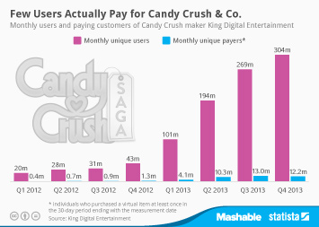
This chart shows how few of King's 300 million users actually spend money on the company's online and mobile games.
More Information
Feb 18, 2014
This chart shows how many U.S. internet users in a committed relationship share an email account, a social networking profile or their...
More Information
Feb 18, 2014
This chart shows the net appreciation of selected tech executives' company stockholdings in 2013.
More Information
Feb 18, 2014
This infographic illustrates key facts about food retail in the United States.
More Information
Feb 17, 2014
This chart shows hospital beds per 1000 people in selected countries.
More Information
Feb 17, 2014
This chart shows how internet adoption in the United States compares to the adoption rates in other countries. China for example lags...
More Information
Feb 17, 2014
This chart shows Facebook's referral traffic as a percentage of publishers' total traffic. In January 2014, 16.2% of the sampled publishers'...
More Information
Feb 16, 2014
This chart illustrates the results of a survey on the social acceptance of homosexuality in different countries.
More Information
Feb 14, 2014
This chart provides an overview of Valentine’s Day in the United States.
More Information
Feb 13, 2014
This chart shows market share figures for smartphone operating systems.
More Information
Feb 13, 2014
This chart shows the average age and annual pay rate of new business founders worldwide in 2013
More Information
Feb 12, 2014
This chart shows new franchise units added in the United States between July 2012 and July 2013.
More Information
Feb 12, 2014
This chart shows illegal immigrant removals in the United States from 2002 to 2013.
More Information
Feb 12, 2014
This chart shows how long Americans are using Facebook and Twitter on different platforms.
More Information
Feb 11, 2014
This chart shows VC funds closed and capital raised over the past 10 years.
More Information
Feb 11, 2014
This chart shows the top 10 most generous donors in the United States in 2013.
More Information
Feb 10, 2014
Percentage of U.S. adults who could not live without the following things.
More Information
Feb 10, 2014
This chart shows attacks by terrorists, insurgents and non-state armed groups in 2013
More Information
Feb 10, 2014
This chart shows the share of acceptance/unacceptance of the following in Russia.
More Information
Feb 7, 2014
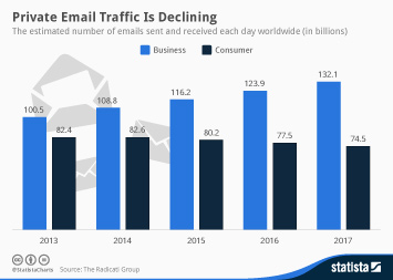
This chart shows the estimated number of emails sent and received each day worldwide.
More Information
Feb 7, 2014
This chart shows the number of tech startups founded in selected cities in 2012/2013.
More Information
Feb 6, 2014
This chart shows the all-time medal count of the most successful nations at the Winter Olympics since 1924.
More Information
Feb 6, 2014
This chart shows the biggest gambling losses by country in 2013.
More Information
Feb 6, 2014
This chart shows the original and actual estimated costs of 2014 Winter Olympic venues.
More Information
Feb 6, 2014
This graphic shows Twitters revenue and losses from 2013.
More Information
Feb 5, 2014
This graphic shows the number of daily searches on DuckDuckGo.com.
More Information
Feb 5, 2014
This chart shows the number of places pledged to Syrian refugees as of January 2014.
More Information
Feb 4, 2014
This chart shows the percentage of male/female Facebook users who cite the following as "major reasons" why they use Facebook.
More Information
Feb 4, 2014
The chart shows the top 10 companies by the number of security vulnerabilities in 2013.
More Information
Feb 4, 2014
Are you personally affected by corruption in daily life?
More Information
Feb 3, 2014
This chart shows a forecast of the B2C ecommerce sales growth 2014 in selected countries.
More Information
Feb 2, 2014
This chart shows the global market share of Windows 7 and 8 since their releases.
More Information
Feb 2, 2014
This chart shows the proportion of people estimated to be aged 65 and older in 2010 and 2050.
More Information
Jan 31, 2014
This chart illustrates how Apple's lead in the tablet market is slowly melting away as the company's competitors are finally gaining...
More Information
Jan 31, 2014
This chart shows the lowest outdoor stadium temperatures at the Super Bowl.
More Information
Jan 30, 2014
This chart shows the NFL teams with the most Super Bowl appearances and wins.
More Information
Jan 30, 2014
This chart illustrates Facebook’s impressive user growth since its inception in 2004.
More Information
Jan 30, 2014
This chart shows TV viewership of the Super Bowl in the United States from 1991 to 2013.
More Information
Jan 29, 2014
This chart shows population growth in the world’s top 15 megacities.
More Information
Jan 29, 2014
This infographic illustrates some interesting facts about one of the most urgent health issues the United States is currently facing:...
More Information
Jan 28, 2014
This chart illustrates how Apple’s growth has all but disappeared in the past few quarters.
More Information
Jan 28, 2014
This chart shows how many smartphones the world's largest smartphone vendors shipped in 2012 and 2013.
More Information
Jan 27, 2014
This chart shows the growth of broadcasting rights fees paid by U.S. networks to air the Winter Olympics since 1984. In 1984, ABC paid...
More Information
Jan 24, 2014
This chart shows milestones of the Mac evolution (by CPU power).
More Information
Jan 23, 2014
This chart shows football clubs’ revenues by source 2012/13 (in million euros)
More Information
Jan 23, 2014
This chart shows lobbying expenditure of selected tech companies in the United States in 2013.
More Information
Jan 23, 2014
This chart shows the percentage of U.S. smartphone users with some sort of alert in these categories.
More Information
Jan 22, 2014
This chart shows the top destination cities by international overnight visitors in 2013.
More Information
Jan 22, 2014
This chart shows the companies that received the most media coverage in 2013. Dow Jones tracks English-language print publications...
More Information
Jan 21, 2014
This chart shows the number of visitors and percentage growth in foreign tourism in India (January to April).
More Information
Jan 20, 2014
This chart shows the number of dolphins killed in Taiji drive hunts from 2002 to 2012.
More Information
Jan 20, 2014
This infographic illustrates key facts on tobacco production and consumption in the United States.
More Information
Jan 17, 2014
This chart ranks the 15 companies that have been granted the most U.S. patents in 2013.
More Information
Jan 16, 2014
This chart shows the college degrees with the highest starting salaries in the United States in 2013.
More Information
Jan 16, 2014
This chart illustrates how young Americans are apparently losing interest in facebook. Since January 2011, the number of users aged...
More Information
Jan 16, 2014
This chart provides an overview of electric and hybrid vehicles.
More Information
Jan 15, 2014
This charts shows a genre breakdown of album sales in the United States in 2013. Rock, R&B and Alternative were the most popular genres...
More Information
Jan 14, 2014
This chart shows the percentage of respondents saying that “married people having an affair is morally unacceptable”.
More Information
Jan 14, 2014
This chart illustrates how much app usage has increased over the past 12 months.
More Information
Jan 13, 2014
This chart shows the football players with the most Ballon d’Or awards.
More Information
Jan 13, 2014
This chart shows Google's largest acquisitions. The search giant made several billion-dollar deals in the past decade with Nest being...
More Information
Jan 12, 2014
This chart shows the actors and actresses with the most Golden Globe nominations and wins.
More Information
Jan 10, 2014
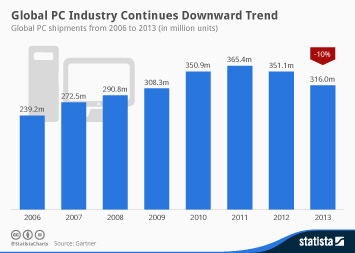
This chart shows global PC shipments from 2006 through 2013. In 2013, 316 million PCs were shipped worldwide, a 10 percent decline...
More Information
Jan 9, 2014
E.U. and U.S. meat imports and exports between 2010 and 2012 (in million U.S. dollars)
More Information
Jan 8, 2014
This chart deals with technology adoption among Americans of different age. It shows how great the divide between young adults and...
More Information
Jan 7, 2014
This chart shows the percentage of workers with a 60-minute commute in U.S. cities.
More Information
Jan 6, 2014
This chart shows vessels hijacked and pirate related activity off the coast of Somalia from 2008 to January 2014.
More Information
Vinyl LP
Jan 6, 2014
During the past ten years, one of the most challenging decades ever for the music industry, the good old vinyl LP has made a surprising...
More Information
Jan 5, 2014
This chart shows the coldest U.S. states by average monthly and coldest ever temperatures.
More Information
Jan 5, 2014
This chart shows a country ranking based on estimated per capita expenditure on information and communications technology in 2013.
More Information
Jan 2, 2014
This chart illustrates how many Americans have had accidents related to on-the-go cell phone usage.
More Information
Jan 2, 2014
This chart shows the percentage of poorest and richest residents holding a fifth of collective household income.
More Information
Jan 1, 2014
This chart shows how selected public technology companies have performed at the stock market in 2013.
More Information
Dec 18, 2013
This chart shows the top selling domestic beers in the United States in 2012.
More Information
Dec 18, 2013
This chart breaks down the revenue of each of the App Store's 10 primary categories, between freemium apps with in-app purchases, paid...
More Information
Dec 16, 2013
This chart shows the distribution of languages on <a href="/topics/737/twitter/">Twitter</a>. According to Semiocast, only 34% of all...
More Information
Dec 12, 2013
This chart shows the highest and average team values across America’s sporting leagues in 2013 (in million U.S. dollars).
More Information
Dec 12, 2013
This chart illustrates that online video consumption greatly varies across different age groups. Younger adults are much more likely...
More Information
Dec 11, 2013
This chart shows the most-commonly visited types of websites in the world.
More Information
Dec 11, 2013
Facebook's significance as a traffic source for publishers is constantly growing. According to <a href="https://blog.shareaholic.com/facebook-referrals-skyrocket-12-2013/">Shareaholic</a>,...
More Information
Dec 10, 2013
This chart shows the 10 cities with the highest estimated spending on anti-ACA advertising in 2013.
More Information
Dec 10, 2013
It's been a little more than a month now since Twitter made its stock market debut in the most-anticipated IPO since Facebook went...
More Information
Dec 9, 2013
Facebook's smartphone app is the most-commonly used app in the United States. According to comScore, more than 75% of adult Android...
More Information
152
/
160
Contact
Get in touch with us. We are happy to help.
Do you still have questions?
Feel free to contact us anytime using our
contact form
or visit our
FAQ page
.
Your contact to the Infographics Newsroom
Felix Richter
Data Journalist
felix.richter@statista.com
+49 (40) 284 841 557