Skip to main content
Consumer Goods & FMCG
E-Commerce
Economy & Politics
Energy & Environment
Health, Pharma & Medtech
Internet
Media
Technology & Telecommunications
Transportation & Logistics
Travel, Tourism & Hospitality
View all industries
Global data volume growth
Global AI market size
Number of generative AI users worldwide
Global inflation rate
Retail e-commerce sales worldwide
Largest economies worldwide
Biggest social media platforms by users
Global EV market share by manufacturer
International tourist arrivals by world region
Global annual CO₂ emissions
Browse recent statistics
Artificial intelligence (AI) worldwide
TikTok
Nvidia
E-commerce worldwide
Global GDP
Instagram
Apparel market worldwide
Video gaming worldwide
Global renewable energy industry
Influencer marketing worldwide
Browse recent topics
Consumer Trends 2026
Artificial Intelligence: in-depth market analysis
E-commerce challenges
Global economy
TikTok
Luxury goods: in-depth market analysis
Electric vehicles: A global overview
Video gaming worldwide
Travel and tourism trends 2026
Battery recycling worldwide
Browse recent reports
Consumer Insights
Advertising & Media
eCommerce
Consumer
Finance
Global Indicators
Health
Industrial
Mobility
Technology
Explore Market Insights
eCommerce Insights
Research AI
Book a demo
All integrations
Developer docs
Explore Statista Connect
Research
Strategy & Consulting
Marketing
Media & PR
Explore AI assistants
Marketing
Research & Development
Strategy
Sales
Find the fact
Tell the story
Win the pitch
Understand the market
Develop your strategy
Academia
Agencies
Consultancies
Consumer goods
Finance
Tech
Research solutions
Strategy consulting
Communication services
Explore Statista+
Statista R
Statista Healthcare
About Statista
First steps & help center
Webinar & training hub
Success stories
Individuals & Small Teams
Businesses & Enterprises
Academia & Government
English
Deutsch
Daily Data
Global stories vividly visualized
Jun 5, 2015
This chart shows the estimated number of dolphins and orcas in captivity worldwide.
More Information
Jun 4, 2015
This chart shows rain per year and days with rain in British towns and cities.
More Information
Jun 4, 2015
This chart shows the highest speaking fees among selected public figures in the United States.
More Information
Jun 3, 2015
This chart shows the countries with the largest share of people in high-skilled employment in 2015.
More Information
Jun 3, 2015
This chart shows the courts with the most petitions for divorce in the past year in England & Wales.
More Information
Jun 2, 2015
This chart shows the change in time consumers spend with selected media per day between 2010 and 2014.
More Information
Minimum Wage
Jun 2, 2015
This chart shows weekly hours at minimum wage to move out of poverty in selected countries.
More Information
Jun 2, 2015
This chart shows the school and university background of Ministers & MPs in the 2015 Parliament.
More Information
Jun 1, 2015
This chart shows the percentage of Americans saying they trust the following news coverage the most.
More Information
Jun 1, 2015
Out of British men/women who have had an affair, who was the affair with? (%)
More Information
May 29, 2015
This chart shows the number of adult TV channels available in EU countries as of December 2013.
More Information
May 29, 2015
This chart shows which social networks marketers consider the single most important to their business.
More Information
May 29, 2015
This chart shows the percentage of employed respondents who have worked/carried out selected tasks on vacation.
More Information
May 28, 2015
This chart shows estimated worker deaths at recent sporting events and migrant worker deaths in Qatar.
More Information
May 27, 2015
This chart shows FIFA revenue from 2003 to 2014 (in million U.S. dollars).
More Information
May 26, 2015
This graphic charts the financial losses suffered by victims of Internet crimes in the United States in 2014.
More Information
May 26, 2015
This chart shows the numbers behind the 2015 Cannes Film Festival.
More Information
May 26, 2015
This chart shows global sports teams with the highest-average weekly pay.
More Information
May 22, 2015
This chart shows the distribution of employment status by country income group in the latest available year.
More Information
May 22, 2015
This chart shows the countries worldwide that allow gay marriage.
More Information
May 21, 2015
This chart shows US foreign military aid to countries in 2014 (in billion U.S. dollars).
More Information
May 21, 2015
This chart shows median annual wages of college-educated workers by major group.
More Information
May 19, 2015
This chart illustrates which activities Americans typically engage in while watching TV.
More Information
May 18, 2015
This chart shows the results of people polled on whether European countries should fund a search and rescue operation.
More Information
May 13, 2015
This chart shows the countries with the most internally displaced people in 2014.
More Information
May 13, 2015
This chart shows responses to violating human rights and founding a "British Bill of Rights" by party affiliation.
More Information
May 12, 2015
This infographic illustrates the evolution of the advertising agency business in the United States. It was created in cooperation with...
More Information
May 12, 2015
This chart illustrates the growth of advertising spending in hispanic targeted media since 2010.
More Information
May 11, 2015
This chart shows the top 10 soccer clubs by value in 2015.
More Information
May 8, 2015
This chart shows the top employers in food, soft beverages, alcohol and tobacco as ranked by employees.
More Information
May 8, 2015
This map shows countries with compulsory voting, no compulsory voting and no elections.
More Information
May 7, 2015
This chart compares Android and iOS in terms of their share of mobile web browsing.
More Information
May 7, 2015
This chart asks "when they reach your age, will today's youth have a higher/lower quality of life than you?"
More Information
May 7, 2015
This chart shows the percentage of the British public liking/disliking the following as a person, regardless of political views.
More Information
May 6, 2015
This chart shows the percentage of US adults reporting heavy alcohol use in the past month by industry category.
More Information
May 5, 2015
This chart shows annual hourly delays per commuter in France's most congested cities.
More Information
May 5, 2015
This chart illustrates the different media preferences of different generations in the United States.
More Information
May 5, 2015
This chart illustrates in which countries women face the highest risk of maternal death.
More Information
May 5, 2015
This chart shows the compensation of top-paid current female CEOs of S&P 500 companies in 2015.
More Information
May 4, 2015
This chart asks: "out of every 100 eligible voters, how many voted in the last election?"
More Information
Apr 30, 2015
This chart shows the estimated U.S. audence size of original series on Netflix.
More Information
Apr 30, 2015
This chart shows the total number of unique U.S. visitors in January 2015 (in millions).
More Information
Apr 30, 2015
This chart shows global wine production (million hectoliters) and vineyard area (hectares) in 2014.
More Information
Apr 29, 2015
This chart shows the number of active monthly Twitter users.
More Information
Apr 29, 2015
This chart shows the percent of U.S. business undergraduates rating the following as ideal employers.
More Information
Apr 28, 2015
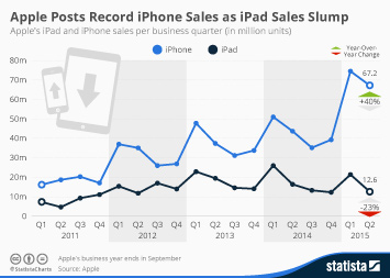
This chart shows Apple's quarterly iPad and iPhone sales since the iPad's release in 2011.
More Information
Apr 24, 2015
This chart illustrates Amazon's revenue and profit growth since the first quarter of 2011.
More Information
Apr 23, 2015
This chart shows confidence among Americans about retirement and related aspects in 2015.
More Information
Apr 23, 2015
This chart shows the share of Britons stating "immigration and asylum are one of Britain's most important issues".
More Information
Apr 23, 2015
This chart shows the percentage who like/dislike presidential campaign logos, regardless of whether they like the candidate.
More Information
Apr 22, 2015
This chart shows average working hours per year in OECD countries (2013 or latest year).
More Information
Apr 22, 2015
This chart shows the percentage of people agreeing that brands and companies have to be environmentally responsible.
More Information
Apr 22, 2015
This chart shows top employers in banking and finance, as ranked by employees.
More Information
Apr 21, 2015
This chart shows the number and type of abusive online posts recieved by Premier League teams this season.
More Information
Apr 21, 2015
This chart shows the percentage of U.S. high school students reporting e-cigarette and cigarette use in the past 30 days.
More Information
Apr 20, 2015
This chart ranks the most-pirated TV shows of 2014 in terms of estimated economic losses suffered by the shows' producers.
More Information
Apr 20, 2015
This chart shows annual hourly delays per commuter in the UK's most congested cities.
More Information
Apr 17, 2015
This chart shows the child mortality rate per 1,000 births by world region from 1960 to 2012.
More Information
Apr 17, 2015
This chart shows reported fatal police shootings since 2009 in selected countries.
More Information
Apr 16, 2015
This chart shows annual hourly delays per commuter in the world's most congested cities.
More Information
Apr 15, 2015
This chart shows emigrants from France living in other countries in 2013.
More Information
Apr 15, 2015
This chart shows the percentage of people in the UK giving their thoughts on what should happen to their Facebook page after they die....
More Information
Apr 15, 2015
This chart shows expenditure on education as a percentage of total public expenditure in selected countries.
More Information
Apr 14, 2015
This chart breaks down global digital music sales by the type of distribution.
More Information
Apr 14, 2015
This chart shows the percentage of spam originating in each country.
More Information
Apr 13, 2015
This chart shows the percentage of the population agreeing they feel close to their neighbours in selected E.U. countries.
More Information
Apr 10, 2015
This chart illustrates the frequency with which American teenagers use the internet.
More Information
Apr 10, 2015
This chart shows the square meters of luxury property $1 million will buy in 2015.
More Information
Apr 10, 2015
This chart provides an overview of worldwide wealth distribution in 2014.
More Information
Apr 10, 2015
This chart shows the top employers in IT, Internet, software and services, as ranked by employees.
More Information
Apr 9, 2015
This chart shows the 10 countries that gave out the most death sentences in 2014.
More Information
Apr 8, 2015
This chart shows drug-induced deaths per million of the population in 2012.
More Information
Apr 8, 2015
This chart shows EU labour costs per hour in 2014 (in euro).
More Information
Apr 2, 2015
This chart provides some of the key facts behind Easter in the United Kingdom in 2015.
More Information
Apr 2, 2015
This chart provides the key numbers behind Easter in the United States.
More Information
Apr 2, 2015
This chart is based on data from the <a href="http://www.forbes.com/forbesinsights/2015_BNP_philanthropy_index/index.html">2015 BNP...
More Information
Apr 1, 2015
This chart shows emigrants from the UK living in other countries in 2013.
More Information
Apr 1, 2015
This chart shows the percentage saying where the following people would sit on their April Fool's target list in 2015.
More Information
Mar 31, 2015
This chart shows international cities with the highest room service costs in 2014 (U.S. dollars).
More Information
Mar 31, 2015
This chart shows origin countries for immigrants living in the UK in 2013.
More Information
Mar 30, 2015
This chart ranks the S&P 500 companies with the largest amounts of cash held abroad.
More Information
Mar 30, 2015
This chart shows the reasons for losses and total number of ships lost at sea from 2005 to 2015.
More Information
Mar 30, 2015
This chart shows the percentage seeing the following as the most important issues facing Britain in March 2015.
More Information
Mar 26, 2015
This chart shows the prevalence of sexual harassment since the age of 15 in the EU.
More Information
Mar 26, 2015
The chart shows America's Top 10 employers as rated by 20,000 employees on a scale from 0-10.
More Information
Mar 26, 2015
This chart shows the salary gap between male and female registered nurses in the U.S. in 2013.
More Information
Mar 25, 2015
This chart shows the 10 countries with the largest Muslim populations in the EU.
More Information
Mar 25, 2015
This chart shows which companies filed the most complaints about illegitimate use of their trademarks in domain names in 2014.
More Information
Mar 25, 2015
This chart shows the percentage of earnings paid in tax/social security contributions in selected countries.
More Information
Mar 24, 2015
This chart shows the number of people that have been killed in commercial plane crashes since 1942.
More Information
145
/
160
Contact
Get in touch with us. We are happy to help.
Do you still have questions?
Feel free to contact us anytime using our
contact form
or visit our
FAQ page
.
Your contact to the Infographics Newsroom
Felix Richter
Data Journalist
felix.richter@statista.com
+49 (40) 284 841 557